Do you know why accessibility is important?
If not, check out our blog category with accessibility resources and other helpful accessibility posts. It doesn’t matter if you think you have people who need accessible content or not; you do need it.
This article focuses solely on making Microsoft Word documents accessible. This is often overlooked, just as performance support is often overlooked as a great form of training. We just published a checklist resource to ensure your Microsoft Word documents are accessible. This post covers all the details of each checklist item in more detail.
It’s easy to throw some content into a Word document and call it good in the name of formatting it pretty. Unfortunately, it’s not always that easy. There are many things you shouldn’t do in Word but can. If you aren’t paying attention, your document could be a nightmare for those using assistive technology.
Accessible content doesn’t just help a select few, it helps everyone.
Accessibility must be at the forefront of our minds when designing documents for all organizations. There could be legal repercussions if it’s not done, and making things accessible is also the right thing to do.
Making a document accessible ensures everyone can read it regardless of their physical or mental abilities and impairments. It allows everyone access to the same high-quality content.
There are some basic things you may already know (and if not, then now’s a great time to learn!), such as creating alt texts for images. But there’s more to accessibility than that. This post will help show you some of those things and how easy it is to make documents accessible.
Why Accessibility Is Essential
When creating a Word document, it’s important to prioritize accessibility. Accessibility ensures that the document is readable and understandable for everyone, regardless of their physical or mental abilities, impairments, or disabilities.
This means that everyone can easily access and use the information in the document. Accessibility also helps people with disabilities use the same content as everyone else, allowing them to gain the same level of understanding of the material.
Accessible Word documents makes your content easier for everyone to use.
Disabilities vary greatly and are hard to pin down as black and white. For instance, I wear glasses, so one of my disabilities would be poor eyesight, but someone else might have worse eyesight or even none at all. It’s important to accommodate all those levels of disabilities whether your organization knows about them or not.
Most organizations don’t know everyone’s disabilities because many go underreported. The majority go unreported. Many of these methods of making Word documents accessible will benefit those with severe disabilities just as much as those with minor disabilities.
I’ll use color contrast as an example. It doesn’t matter if you consider yourself to have a disability or not; reading text with low contrast is difficult, especially on a computer screen.
It doesn’t help that every computer screen varies, so while text might be readable to you, it might not be on a different computer screen. By keeping these things in mind, you’re formatting your content to be helpful to everyone.
Can you read this?
See how color contrast can make your content hard to use for everyone? There are many ways of creating accessible content that benefits everyone, not just those with disabilities.
These 12 ways of making Word documents accessible will likely help a much larger audience than those each of them is intended to help.
The 12 Ways to Make Microsoft Word Documents Accessible
Microsoft Word accessibility is relatively easy to navigate with this list. You’re also welcome to download the Microsoft Word accessibility checklist we put together to help you make sure every document is accessible.
These ways of making Word documents accessible came from our knowledge and the AED COP video resources available on the Section508.gov website. They go into much more detail than this article if you want more information.
Each video covers an introduction, how to author accessibly, how to check your work, inaccessible examples, and accessible examples. The entire series will take you just under an hour to watch.
But we put this together to capture the gist of the videos and provide you with the most important parts in less than an hour.
The images in this post are all captured on the Microsoft Word version for Mac, but the Windows version is nearly identical. Any difference is very small since Microsoft made both versions similar.
So onward with our first method of making Microsoft Word documents accessible.
Inline Text Boxes, Images, and Objects
All text boxes, images, and objects must be inline with text. This ensures screen readers know the order in which the content needs to be read. If things aren’t in line, the content won’t make much sense to someone with little or no vision.
Here’s how you can make anything in line with the text.
Step 1: Select the text box, object, or image.
Step 2: Click the Shape Format tab in the Microsoft Word ribbon.
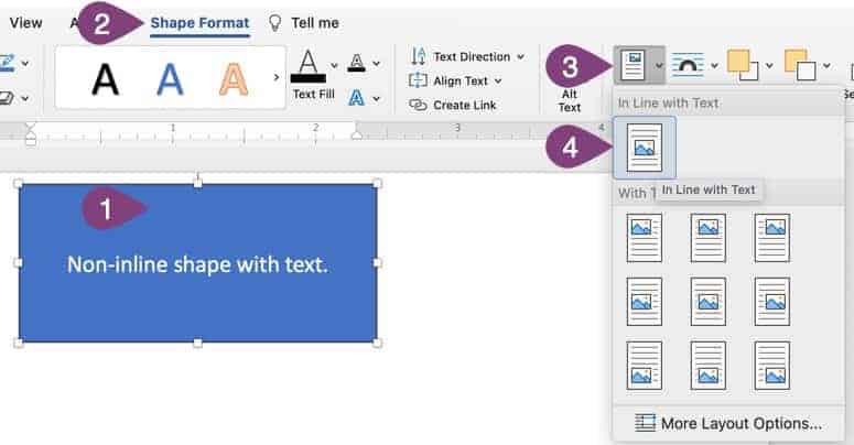
Step 3: Click the Position button.
Step 4: Click the In Line with Text button.
That’s it!
Your text box, object, or image is now in line with the text. You have more limited ability to move the item, but it’s accessible and makes sense in the flow of your content. In-line items are the only ones accessible; there’s no way to move items while still having them accessible freely.
Describe Images & Objects
There are three options for this one. You may already know about alternate text, but other ways exist to provide information about objects and images.
Here are the three options for describing the content of images and objects in Microsoft Word:
- Provide alternate (alt) text.
- Use a descriptive caption.
- Provide information near the object or image or in the appendix.
Ensure you provide a good description of 250 characters or less for important objects or images. Don’t provide descriptions for decorative images or objects. We put together a short video about document accessibility that covers the alt text method and provides more context about providing good alt text.
Here’s how to do each one.
Alt Text
You can right-click on the image, but these instructions go through using the Word ribbon. Here’s how to add alternate text to an image in Word. It works the same way for objects.
Step 1: Select the image or object.
Step 2: Click the Picture Format tab in the Word ribbon.
Step 3: Click the Alt Text button.
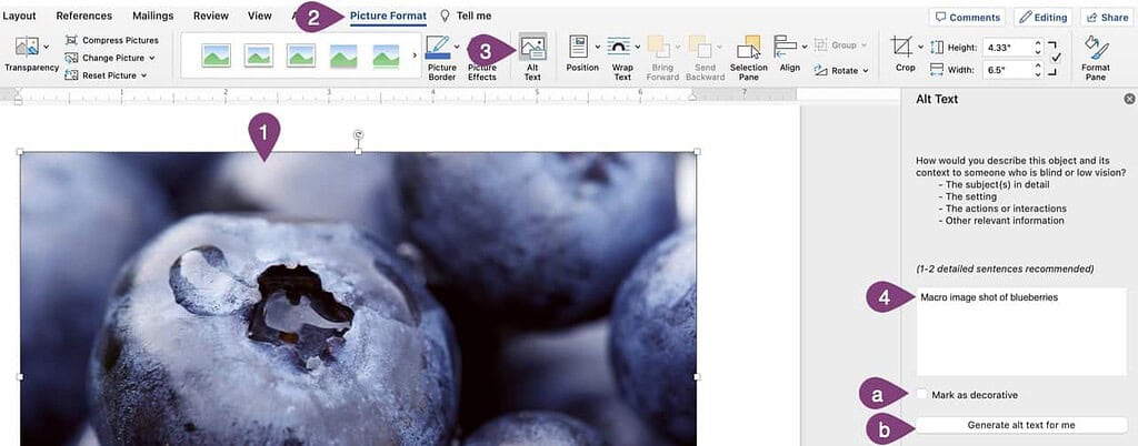
Step 4: Type a good alternate description less than 250 characters long.
Note: Microsoft Word stock images already come with alt text, but you will likely want to update them or mark them as decorative if they have no functional purpose in the document.
Option a: If an image has no functional purpose in the document, mark it as decorative.
Option b: You can take your chances at Word’s ability to provide valuable alt text through AI. I don’t recommend using it, but you’re welcome to try!
That’s it! Now screen readers will read the provided alt text instead of the image. However, there are alternatives to alt text that are just as good for giving context to images and objects.
Caption
You can also put a caption below the image using Word’s caption tool. Here’s how to do that.
Step 1: Right-click on your image or object.
Step 2: Click Insert Caption…
Step 3: Type in a descriptive caption no longer than 250 characters.
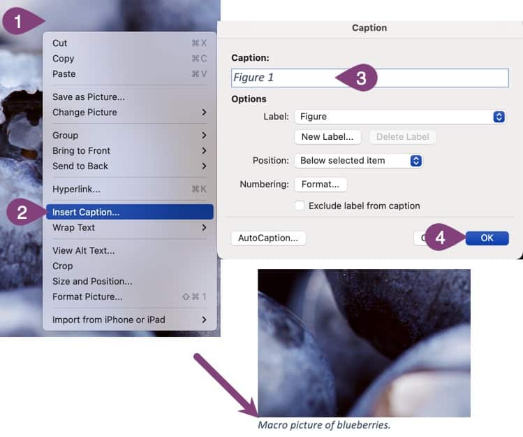
Step 4: Click the OK button.
Now you have a caption below the image. Word also puts in the “Figure 1” text, but you can manually edit that as I did above.
Information Near Object or In Appendix
This one doesn’t require any visuals to explain. Suppose the written content sufficiently describes an image, and you’re obviously describing it. You don’t need to duplicate that information since the screen reader has already read about the image.
Alternatively, suppose the image information isn’t essential then and there but is still helpful. In that case, you can describe what’s in the image in the appendix as long as you refer to where more information can be obtained in the appendix. You can find more details on creating an appendix in the Microsoft Word help article.
Sufficient Color Contrast
You can check the color contrast of your text in many different ways. I urge you always to use these tools, whether using different color text or even deciding on the colors for your brand (yes, we used it). These tools will always help you determine if the text color you use against the background color has sufficient contrast.
There are also things to consider with contrast, such as size. So, it’s not just about color.
Here are the general guidelines for contrast in documents:
- Standard Text (anything not bold but less than 18pt): 4.5:1 contrast ratio.
- Bold text or 18pt or great regular weight text: 3.5:1 contrast ratio.
You can use the Color Contract Analyzer (CCA) by TPGi, which is a downloadable tool, or you can use this online tool: WebAIM Contrast Checker. Just input the foreground color and background color to get the ratio. It’ll tell you if you meet the correct contrast ratios for different text types.
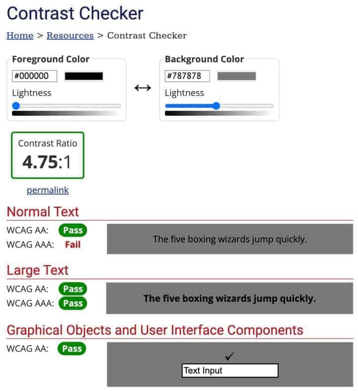
The colors I chose above have a contrast ratio 4.75:1. This is great for most tests except for WCAG AAA, which is stricter than the Section 508 guidance. WCAG is a standard for internet accessibility. It’s also a good rule of thumb to stick to it, for the most part, in Word, too.
Word also has a basic contrast checker built-in, but it doesn’t tell you the actual contrast ratio, just that you don’t meet it.

You’ll see this along the bottom of the screen (yes, with horrible contrast…), and when you click it, a menu will open a side panel that says, “hard to read text contrast.” That’s helpful but not helpful enough. Use contrast ratio checkers to make it easy on yourself.
Descriptive File Name
No visuals are needed for this, either. Just make sure you name the Word file a descriptive name that makes it easy to understand what’s in it. Also, be sure you always use the .docx file format.
A bad file name would be something like untitled.docx, whereas a good name would be “Microsoft Word Accessibility Checklist.docx,” which makes it easy to know what’s in the document without opening it. Better yet, you can also include the version number in the file name if you have multiple versions of the same file.
Header Styles
Microsoft Word has built-in styles for headings, subtitles, titles, etc. Use these styles to create a hierarchy in your document rather than using size and bold. Screen readers can’t infer hierarchy by formatting, but they can do so from Word’s built-in styles.
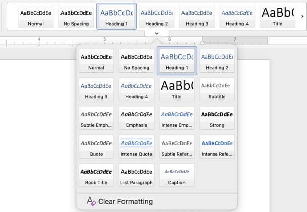
Above is an example of the Word styles menu that you can expand by clicking the small tab on the bottom. Plenty of options exist to create a good visual hierarchy and change the text’s look once you set the style. Even if you change the text format, screen readers will still know the hierarchy if you don’t change it.
Here’s what some header levels look like in a Word document.
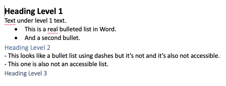
It’s as simple as that. Just use the styles from Word to create a visual hierarchy, not formatting and size. You can even get more complex and use tools to change the default styles in Word to make your document consistent and easy to manage while being fully accessible.
List Styles
Screen readers won’t read a list as a list if you don’t use the official built-in list styles in Word. Did you know that?
If you didn’t, then you do now. Don’t use dashes, asterisks, numbers, or anything else to make lists ordered or unordered. Always use the buttons to create lists in Word and adjust them as needed.
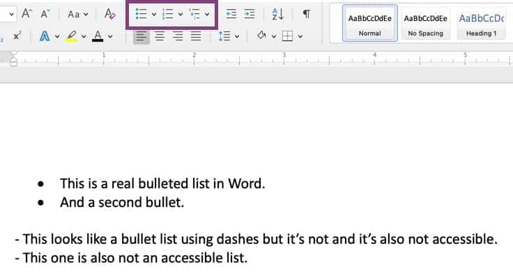
If you want a list that looks like dashes, click the drop-down arrow next to the bullet button and select Define New Bullet…
That way, you can select any symbol from the list and make it look like whatever you want while still using the built-in functionality for lists in Word.
Built-In Columns
Don’t use spacing or tabs to create the look of columns in Word. Instead, use the columns button to make any number of columns you need. You can create columns in only one part of your document rather than the whole page.
What happens if you use spaces or tabs to create the look of columns?
The content is read in screen readers from left to right across all the columns and then the next line from left to right. In other words, the content will read oddly to someone using a screen reader. When you use columns, screen readers know to read left to right and top to bottom for each column instead of across the entire line.
Without screen readers, we can read these two columns properly.

But for a screen reader, it would read like this: Beauty is not in the face; beauty is a light in the heart. The best and most and most beautiful things in the world cannot be seen or even touched – they must be felt with the heart.” – Khalil Gibran – Helen Keller
That reads quite odd if you read across the columns, but that’s exactly what happens when you don’t use columns in Word and instead opt for spaces or tabs.
Moral of the story? Use columns, not spacing or tabs.
Identify Languages
This only applies if you include some text in a Word document in a different language. So, perhaps you have a document written in English containing one Spanish quote within the text. You must mark that quote as being in Spanish.
When you set the correct language, assistive technology can correctly read and pronounce the other language.
Here’s how you change the language for a portion of your document.
Step 1: Select the portion of text that’s in a different language.
Step 2: Click the Review tab in the Word ribbon.
Step 3: Click the Language button.
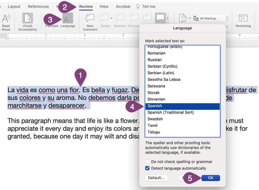
Step 4: Choose the language of your text.
Step 5: Click the OK button.
That’s it! Now the spelling squiggles will disappear because Word will know that section of the text is the language you set. Not only that but that information will also be read correctly. If you click the Language button again, you’ll see that English and Spanish are used in the document in my example.
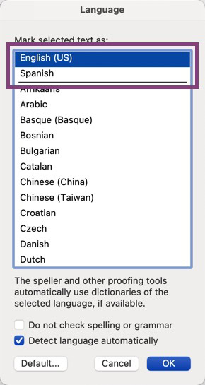
Those two languages above are what’s used in my document. Anything above the double line is marked somewhere in the document. Word isn’t very good at detecting languages automatically because, as you can see, that option was selected, and it still didn’t detect it.
Unambiguous Link Names
Never use the link name “click here” or anything similarly vague. Always link the part that describes the content in the link. It could be email us and a link to an email address or similar to a blog post title with a link to the blog post.
If you scroll up in this blog post, you’ll see how I made the links descriptive instead of click here to read about XYZ with only the click here linked. Click here isn’t even good text to use because you don’t know how people will use the link. They could be tapping, clicking, or something else entirely.
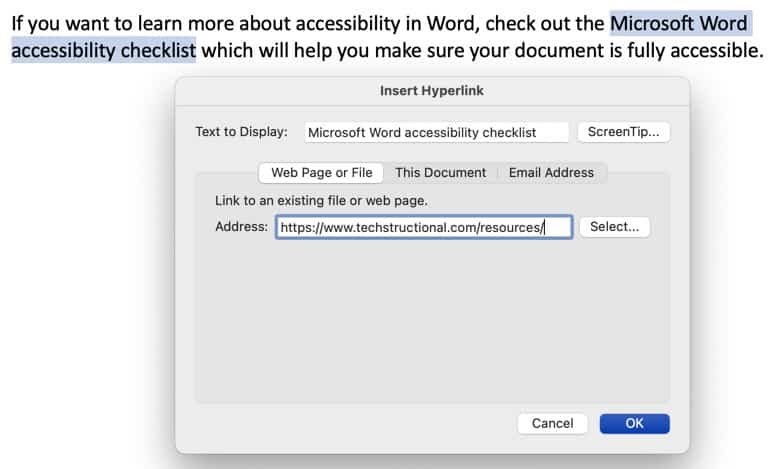
The above image is a great example of a descriptive link. The text “Microsoft Word accessibility checklist” is highlighted and links to the resources page where people can find the checklist. You can also find the checklist on our resources page.
Layout & Data Tables
This one is a bit more detailed and complex. First, let me define layout tables vs. data tables.
Layout tables are used to lay out content in a very specific way, whether you show the borders or not. A good example is if you used a table to place three images next to each other.
A data table is used to display data in a table format. So, you could put data into a table format, such as a calendar with the days of the week and dates in each cell below that. There are also two types of data tables. They can be simple or complex. The example I gave is a calendar with dates, which is a simple table.

There are also complex data tables that have merged cells which makes them more complex and not accessible. So, don’t use complex data tables with merged cells if you want your document to be accessible.

Complex tables are not accessible.
To make a table accessible in Word, you need to create the table in Word rather than pasting it from somewhere else. In addition to that, you must include only one piece of information or data point per cell. In other words, don’t include multiple lines of text in one cell to line up information.
If you have a header row in your table, such as in my example, where I have the days of the week, you need to mark that row as a header row in Word.
Here’s how to do that.
Step 1: Click on the row you want to make the header (this should be the top row).
Step 2: Click the Layout tab in the ribbon.
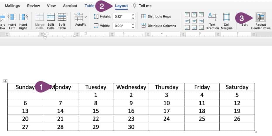
Step 3: Click the Repeat Header Rows button.
That’s it!
You now have an accessible table as long as it’s simple (no merged cells), created in Word, in line with text (yes, tables are an object), and the header row is marked properly.
Duplicated Header, Footer, Watermark Content
If you have content in your header, footer, or a watermark in Word, that information won’t be read by screen readers. So, you must also duplicate that content in the document itself.
So, if your document is marked as a draft in the header, also say it’s a draft in the content.
It’s as simple as making sure important information from the header, footer, or wordmark is duplicated in the content also.
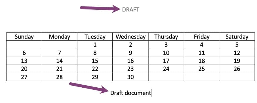
Notice how the header in the image above has important information. People need to know this is a draft document; therefore, I also duplicated that information in the body content.
Accessible Embedded Files
Just like multimedia needs to be accessible when it’s on its own, it must also be accessible when embedded in Microsoft Word. That means your audio, video, and multimedia files must be accessible. You can provide the necessary information for accessible embeds in many different ways.
- Audio Only: Provide a text transcript just below the embedded audio file.
- Video Only: Provide a text description of everything important in the video.
- Multimedia: Provide a text transcript (or closed captions) as well as a description of important things that happen in the video.
There isn’t a great way to do any of them without having the text accompany the video or audio. But if you’re working with video, it’s best to use a video hosting platform and include subtitles or captions.
Embedding objects in Word is pretty complex, and the support is lacking, so your best bet might be not to embed any media files into Word directly. That’s up to you, but be aware that they should be accessible with full transcripts and/or time-synchronized captions.
Use The Word Accessibility Checker
If you’re not sure if your document is accessible, then Microsoft Word (and all other Office applications) has a handy dandy tool built in to help you out. We wrote about it in more detail in another post, so you may want to check out our article about the Microsoft Office accessibility checker, which also has info about checking PDFs.
Here’s a quick overview of the accessibility checker. At the bottom of Word, you’ll see the checker. When you click it, you’ll get a list of things that aren’t accessible or might not be accessible. It’s not 100% accurate, and you can’t check everything, so use it as a guide, but don’t let it have the final say.
Here’s how you access and use the accessibility checker.
Step 1: Click the Accessibility button at the bottom of your document.
Step 2: Expand items to see what needs to be corrected and click on each one.
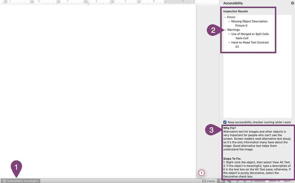
Step 3: Review why you should fix the issue and, if possible, steps to resolve the issue.
Word guides you on how to fix most issues and selects the object that’s an issue as you click on the issue. It’s a handy way to see the main accessibility issues in your Microsoft Word documents.
Wrap Up
If you stick to these methods of creating an accessible Word document, you’ll make better content that’s accessible to all. If you export your Word document to a PDF, you should also check that because some things are different for PDF documents. We have a handy dandy article to help you check your PDF documents for accessibility.
As you can see, making a Word document accessible isn’t difficult. By following the steps outlined above, you can easily ensure all your training documents are accessible to everyone. It’s a great way to ensure everyone can benefit from your content regardless of their physical or mental abilities.
Not only that, but I’m sure you probably saw several ways that everyone will benefit from accessible content, not just those with a disability. Some of them also make things easier for you, such as no more red squiggly lines under a different language.
Win-win!
If you haven’t already checked it, head to our resources page and download the Microsoft Word accessibility checklist. It will help you make accessible documents every time without missing a single important task.
And, if you need some assistance creating awesome training content that’s also accessible, schedule a free consultation, and we’d be happy to discuss your next technical project and how we can make training awesome for your employees and effective for your organization.

2 comments
Michelle Buck
This is such a great article! I am writing about ebooks and creating accessibility – I am going to link back to this article. There were some things in here I didn’t know about. Thank you for sharing!
Nick Leffler
That’s great to hear, Michelle! Always happy to know knowledge is spreading about making content accessible. I’m glad this article helped you and will help others, too.